Android components Data display
StanceCard
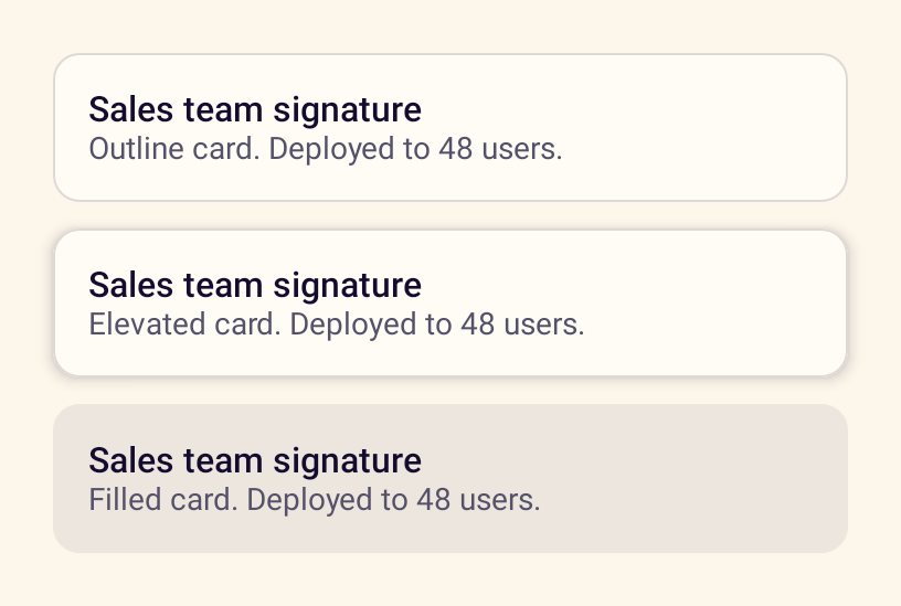
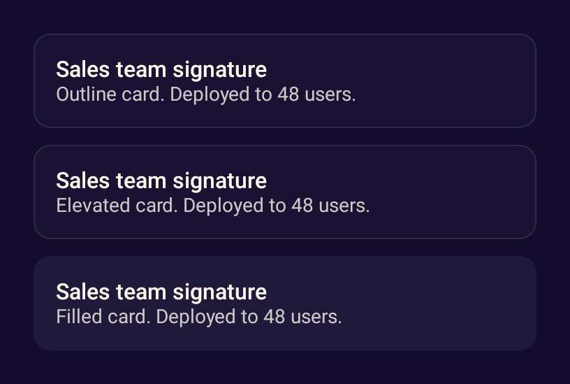
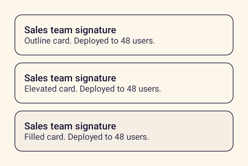
BetaGroups related content in outline, elevated or filled styles, optionally as one clickable target.
- PlatformAndroid, Jetpack Compose
- Builds on
Surface - Kindcomposable
Preview
Rendered by the Jetpack Compose library, not drawn by hand.
Usage
StanceCard(variant = StanceCardVariant.Outline, onClick = {}) {
    Text("Sales team signature", style = StanceTheme.typography.title)
    Text("Deployed to 48 users", style = StanceTheme.typography.bodySmall, color = StanceTheme.colors.fgMuted)
}
Accessibility
- A clickable card is one action for screen readers.